Wondering if your current website is up to the challenge for today's mobile users? Let's look at the mobile usage trends from last year...
Over the course of one year, mobile users share increased by over 10%
In the course of one year, desktop internet usage dropped from 54.86% to 48.88% while mobile users share marked an increase from 37.38% to 47.59% in 2021.
Millennials spend 3 hours and 45 minutes browsing on their mobile devices
Internet users aged 25-34 spend 3 hours and 45 minutes browsing on their mobile devices.
There are over 4 billion unique mobile internet users
The global internet population reached 4,48 billion active users with over 4 billion people browsing on their mobile devices.
Source: Tech Jury

With so many active users accessing websites from their mobile devices, it is key to your website's success that it is readily accessible via mobile.
So how do you ensure your website design is mobile responsive?
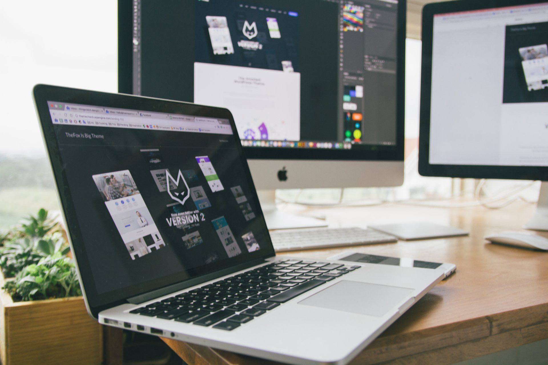
Check with your web developer
Most website designers and developers design with a 'mobile first' approach, with the growing numbers of users reaching for their mobile to browse online. If your website has been online for a while, you might consider a re-design to ensure your website design is thoroughly compatible with the current mobile devices.
Make your website user friendly
Many website designs offer different content on mobile to their desktop versions. From a design perspective, mobile devices can rarely incorporate the same level of content as a desktop view, due to the reduced space available. So you might find it necessary to reduce the number of images on mobile versions of your website. Or reduce the level of immediate content, for example, adding accordions on mobile websites, instead of paragraphs of text, so consumers can select information if they so wish, but can also scroll past it if it is not relevant to their search.
Make sure your logo is readable on mobile
Some logo designs which look great on desktop, are simply not legible when they are shrunk down to a mobile size. It's always a good idea when designing your logo to zoom out on it to about 30% view to see how it would look on a mobile device. This can make designing your logo a bit tricky! But here are a few tips to help you design your logo for mobile:
- Keep it simple - anything overly complex will not be seen when shrunk down in size
- Keep font sizes relatively large
- Consider removing strap-lines from mobile versions of your logo
- Use clear fonts - some script fonts and thin-lined serifs can become illegible on mobile
Font selections
Again, with your font selections, a simple, clear font for mobile will make your content easier to read. Also take your fonts up a few point sizes for mobile to increase usability.
Burger menus
Adding a burger navigation to your mobile website will make your website easier to navigate than a traditional desktop navigation bar. It allows your menu to be vertical, giving it more room for both visibility and click-ability.
Make your shop work really well on mobile
Allowing consumers the ability to buy your products straight from their mobile, with no hassle will increase your chances of repeat sales. As a consumer you know how frustrating it is when mobile checkouts don't work, or the product images are too small to see on mobile, or the shop pages don't render correctly. Make sure your shop is working perfectly on your mobile - do a few test runs, see if there's anything you can improve on.
With 47.59% of internet users regularly browsing and shopping from their mobiles, make sure your website design is ready for them!
If you want some advice on getting your website more mobile friendly, talk to Lollipop Rocks - our team are here to help.
A little bit about us...
Lollipop Rocks is a website design agency based in Cheshire. We help businesses get online quickly and affordably, specialising primarily in flexible pay monthly website design packages, starting from £25 per month. We also offer a great range of pay upfront websites for all sizes of businesses. If you're looking for a new website, get in touch today to find out how we can help.